On this page
No Headings
Last updated: June 4, 2026
The branded Log in with PayPal buttons use the Identity API and offer built-in properties that ensure a consistent design experience. However, you may want to create your own custom Log in with PayPal buttons to better fit the design of your website or app.
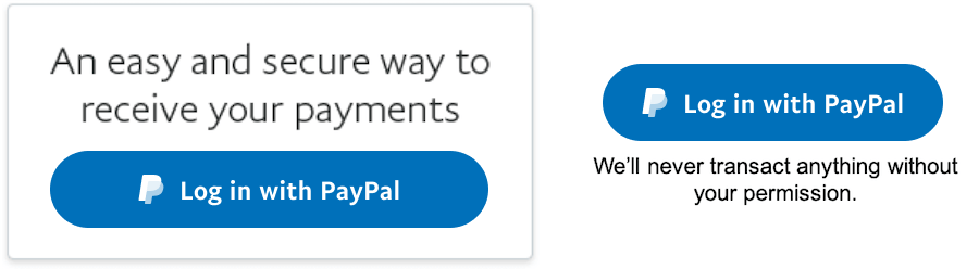
The following are PayPal's branded Log in with PayPal buttons:
When creating custom Log in with PayPal buttons, abide by the following design guidelines:
When you use Log in with PayPal to enable account creation and log in, use either the label Log in with PayPal or Continue with PayPal. We recommend these labels because they most accurately reflect the purpose of the button. Depending on the context of your website, Log in or Continue might also be good choices.
You can choose the font, font weight, and kerning that fits the style of your website or app. Easy legibility is always important. The smallest size we recommend is 13 pt and Sans-serif typography.
We recommend button background colors of gray #EEEEEE and the PayPal accessible blue #0070BA.

To ensure good contrast and legibility, use white font color on dark backgrounds and black font color on light backgrounds. If you decide to use other colors that are more appropriate for your website or app, always choose a combination of colors that fit within accessibility parameters.
For best results always put the button over white or light backgrounds.
Depending on the devices and context of the user action, always use an appropriate size for your button. For example, for mobile apps, always use the button close to the thumb position and be sure it's big enough to be tapped. Keep in mind that larger buttons tend to lead to higher conversion rates.
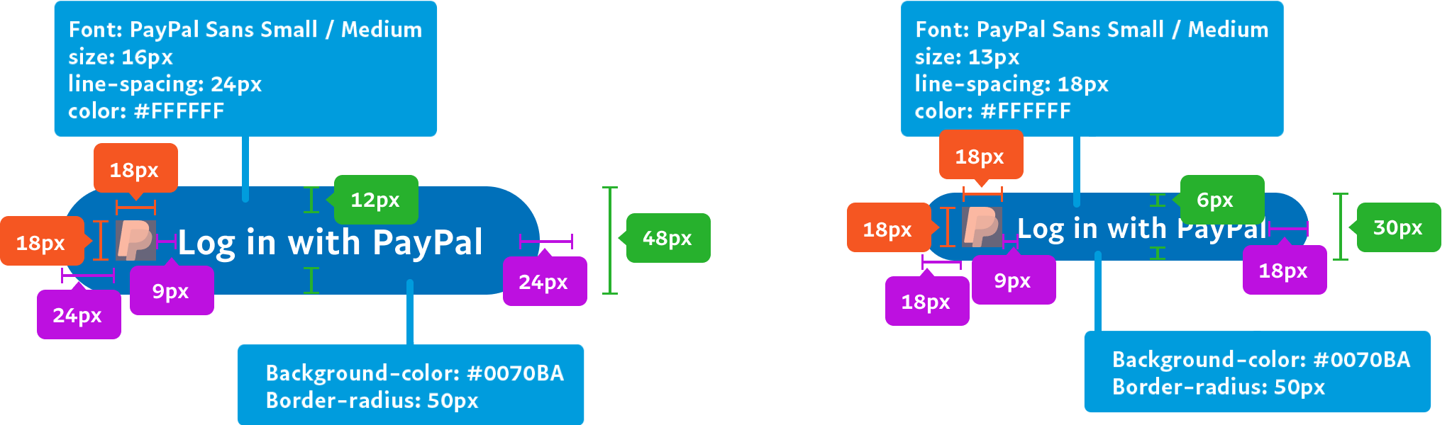
These are the minimum sizes you can use for padding and margins. If needed, you can scale the size upwards, but you should always try to balance the proportion of all of the elements.
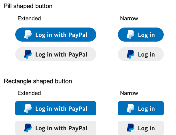
You can use any button shape that works for your app or site, but we recommend the pill-shaped button because its strong association with PayPal will lead to faster recognition by users. A rectangle-shaped button is also available.
Use the correct PayPal icon from PayPal Logo and Marks. The PayPal icon is available in various sizes for button scaling, but the proportions and typography style must stay consistent with the ones described on the original button.
Use the version of the PayPal icon that matches the color on your button. If you're using a colored button, use the white version. If you're using a white button, use the colored version of the PayPal icon.
Don't use any other icon, an outdated version, or a custom variation. Doing so could give the impression that your app is outdated or untrustworthy.
| Do | Don't |
|---|---|
You can increase the size of the margins (left and right) to adjust for your implementation. | Don't reduce the minimum size of the padding. Don't change the aspect ratio of the elements.  Don't change the alignment and the position of the elements within the button.  Don't stretch any of the elements on the button. Elements must always maintain their proportions.  |
Although we don't recommend changing the color of the button, you can do that if it results in a more accessible button for your site. | Don't change the background color on the colored version of the button.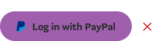 |
Although we don't recommend changing the shape, you can customize it to one that makes sense with your site as long as you always maintain the minimum sizes for paddings and margins. |
Including messaging next to your button can add more context and clarity about what's going to happen next and the actions that the button triggers.
Reassure your users that your app doesn't actually see or do any money transactions on their behalf and that it doesn't share anything private without their consent or being notified.
We don't share your money transaction history.
We'll never transact anything without your permission.
Log in with PayPal pre-fills your shipping address and preferred payment method while offering all the security of PayPal.